 |
STATISTICS
A web-based unit
for Integrated
Algebra
|
|
Scatter Plots & Correlation Listen to a lecture on scatter plots, or read the lecture below. How to make a scatter plot: A scatter plot is very similar to graphing data and drawing a line of best fit, which you are probably familiar with from science. For our example, we are going to plot data from an experiment to see if the amount of TV a student watched the night before a test was related to the student's test score. The data from the experiment is displayed in the table below.
1.) Draw and label
the axes
Our first step in drawing a
scatter plot of this data is to draw and label our axes.
 On the x-axis I have placed the hours watched. If time is one of the variables in your data, it is generally going to go on the horizontal axis. The scale is labeled, with every two boxes representing two hours. The x-axis is also labeled "Hours Watched." On the y-axis I have placed the test
scores. Since the scores go up to 100, I counted by fives,
labeling every other box as 10. I also labeled the y-axis "Test Score."
The last label I had to
include was a title. I simply took the title, "A Test of
Television," from the data table, and recommend you do too, whenever
possible.
2.) Plot the data points. Once you have drawn and
labeled the axes, it is time to plot the data points. We are
going to
treat the data like coordinate points. For example, one student
watched 1.5 hours of TV and earned a test score of 85. On the
graph you should plot the point (1.5, 85). Do this for each piece
of data.
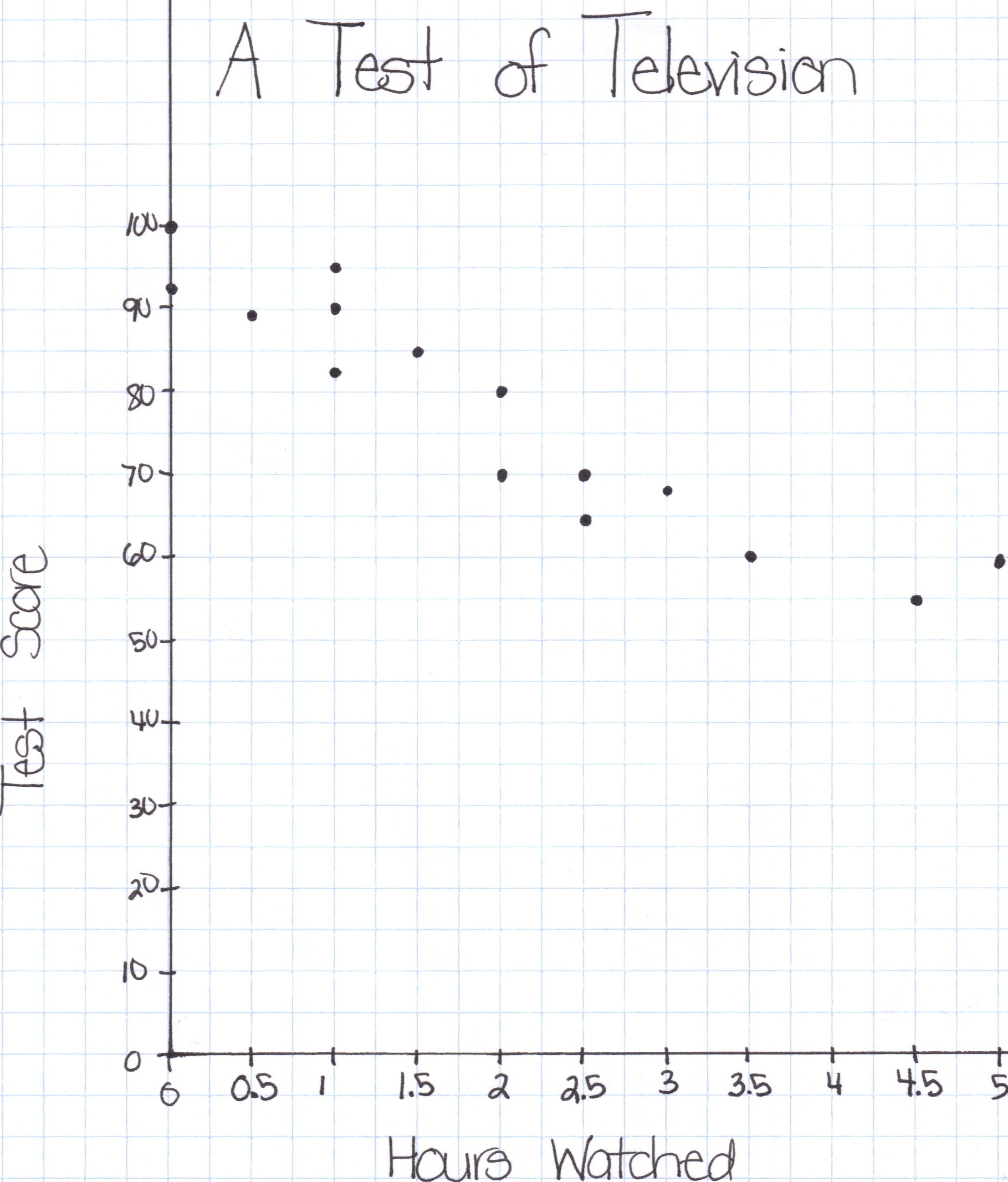 DO NOT CONNECT THE POINTS! 3.) Draw a trend line. After
plotting all your data points, it is time to draw a trend
line. The trend line is the same as a line of best
fit. Its purpose is to help determine how the two sets of data
are related (if they are related at all), and help predict data.
To draw the trend line, use a
ruler. The goal is to draw a line that passes through as many
points as possible, and as close to the points as possible.
 Now that we have graphed the line of best
fit, it is possible to write an equation. Simply take the y-intercept from the graph and find
the rise and run to determine the slope. Use this information in
the slope-intercept form for a line (y=mx + b) to find the equation of the
trend line.
The line above has a y-intercept of 96 and a slope of -9. So, the equation for the trend line is y = -9x + 96. Correlation: View a short digital story explaining the different types of correlation. Practice:
|
|||||||||||||||||||||||||||||||||||||||||||||||||||||||||||||||||||||||||||||||